Steven Heller’s Font of the Month: Ege Basalt — I Love Typography Ltd
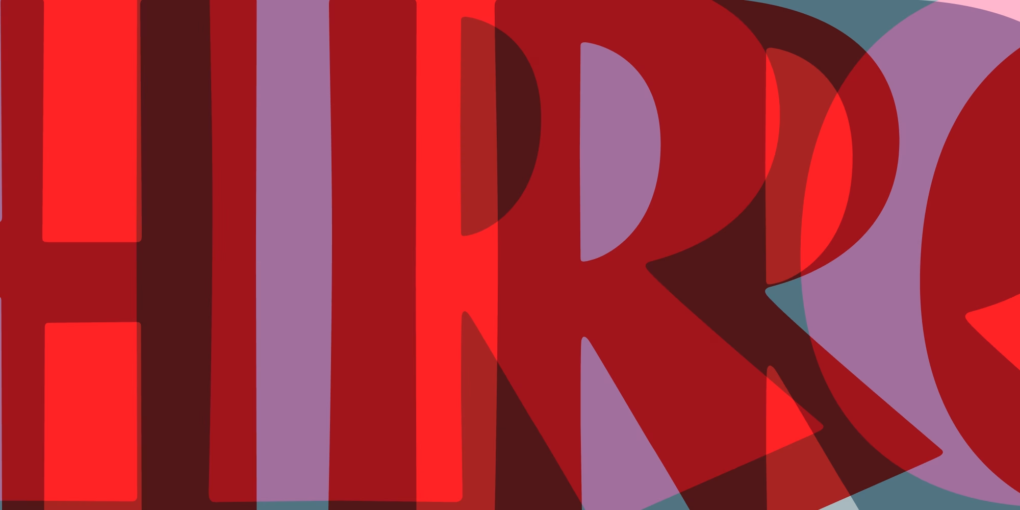
I’ve forever fancied fat faces. And not just for the alliteration. A comparatively new design with vintage flavor, the Ege Basalt family that features five fonts (Bold, ExtraBold, Heavy, Medium, and Regular) in a “Cubist Bold” art deco-inspired sans serif, I’ve found the perfect weight. Not only are the Bold, ExtraBold, and Heavy mammoth to an extreme, but the Medium, Regular have a grandiose blackness that perfectly complements their corpulent cousin.
ilovetypography.com

What We Get Right at Home and Wrong in Public | Strong Towns
The three traps that keep us from building better places.
strongtowns.org
structure in type design
ilovetypography.com
structure in type design
ilovetypography.com
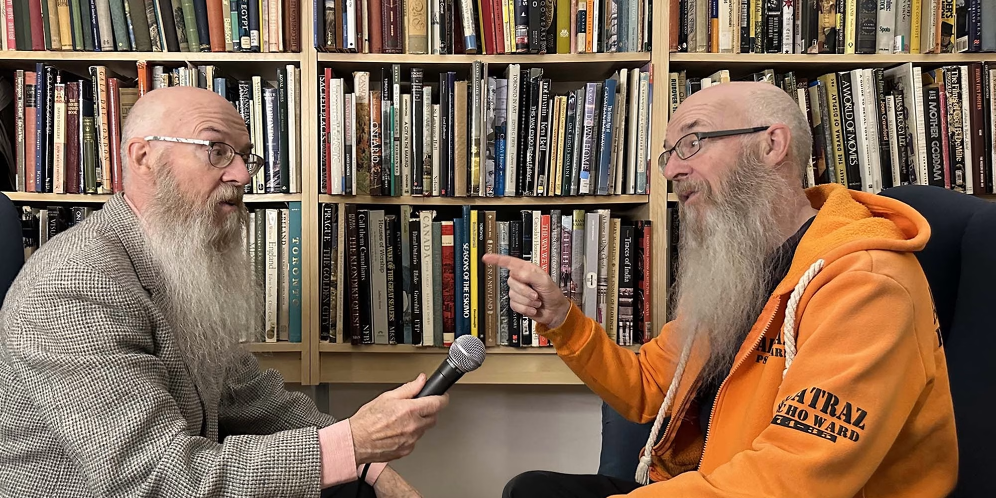
Font Faces: Nick Shinn — I Love Typography Ltd
Welcome to the debut issue of Font Faces: the people behind the type. We ask type designers from around the globe the same five core questions (plus some potential follow-up or topical questions) and thus gain some insights into their working practices, their personalities and what makes them tick. Nick […]
ilovetypography.com

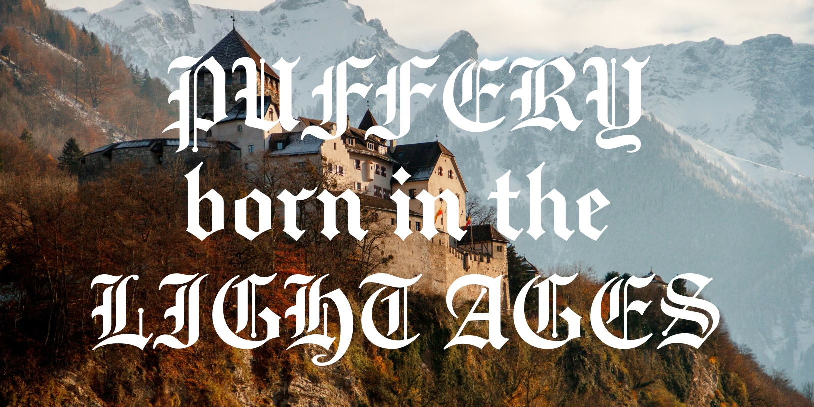
Steven Heller’s Font of the Month: Puffery — I Love Typography Ltd
Steven heller takes a closer look at Shinntype’s Puffery, a Blackletter typeface for the 21st century.
ilovetypography.com
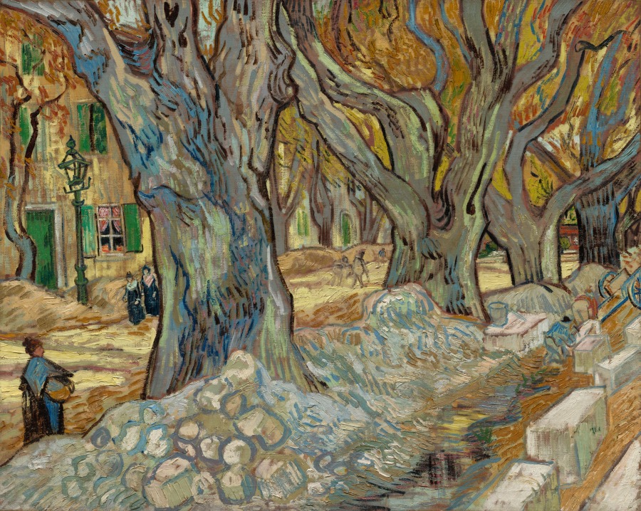

Jim Parkinson, 1941–2025
Jim Parkinson—lettering artist, type designer, and painter—died today at his home in Oakland, California, after a long struggle with Alzheimer’s.
typographica.org

Elizabeth Carey Smith
“I hope that we can have more frank discussions about the problems of industry inclusiveness and the approach and sense of responsibility around design, specifically in the world of type. With that in mind, I had a candid conversation with Elizabeth Carey Smith, a design director in New York and a past president of the Type Directors Club.” —Agyei Archer
typographica.org
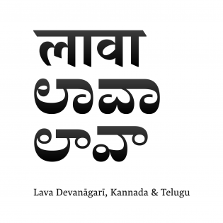
Lava Devanagari, Kannada, and Telugu
Typotheque collaborated with Indian type designers for Devanagari, Kannada, and Telugu extensions of Lava. Knowing these scripts as natives gave the designers the confidence to stretch and play with the design within the constraints of an editorial brief. In my opinion, this confidence and familiarity are what bring all of the scripts into harmony while keeping them true to their individual nature.
typographica.org
Now Open: the Typographica Library
We just launched the Typographica Library, a digital bookshelf of type and lettering resources to aid research and selection.
typographica.org
Elfreth
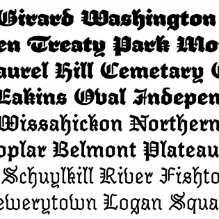
I can count the number of times I’ve used a blackletter (unironically, anyway) on one hand. But something about Elfreth caught my attention and held onto it like a Brockhaus-Heuer Schraubstock.
typographica.org