steven heller’s font of the month: zinkraft
ilovetypography.com
Steven Heller’s Font of the Month: Brutal Types — I Love Typography Ltd
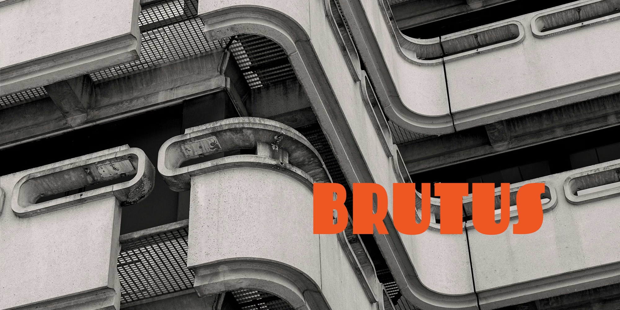
"Brutal" is such a nasty, albeit seductive, word. A quick visit to my desktop Oxford dictionary confirms that the adjective “brutal” is, etymologically speaking, derived from a corruption of the name Brutus, the Roman immortalized as Julius Caesar's infamous assassin (tip of the hat to William Shakespeare). "Brutal" in current usage has several related literal meanings, including heavy, bulky, inert, and lifeless, that figuratively imply stupid; thus, the name Brutus for the thick-headed bully in Popeye cartoons. We’ve all known someone who is brutal — thoughtless, mean, and sadistic. Then there is Brutalist architecture, which takes its name from the French word for concrete: béton brut. It signifies buildings that are constructed with exposed concrete, characterized by geometric austerity and fortress-like impenetrability.
ilovetypography.com
LL Blankenhorn
Whenever I’m in Germany I’m struck by the prevalence of hand-lettered book covers. German publishers also seem particularly unafraid of omitting imagery from their covers, letting the title do all the selling of the book. This works especially well when the title is rendered by expressive lettering, and there are few examples as effective as Fritz Blankenhorn’s for Deutscher Bücherbund. On these covers, the text <em>is</em> the image.
typographica.org
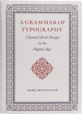
A Grammar of Typography: Classical Book Design in the Digital Age
Argetsinger aims to teach a new generation of designers how to uphold the standards and principles of the printers of old, in this strange new era when the composing stick is a text frame and the ink stone is a menu of swatches.
typographica.org
Type Design in the Museum: Acquiring the Immaterial
Craig Eliason explores how the peculiarities inherent to type design shed light on the purpose and practices of the design museum in the contemporary world.
typographica.org
steven heller’s font of the month: loopy
ilovetypography.com
Steven Heller’s Font of the Month: Gilway Paradox — I Love Typography Ltd
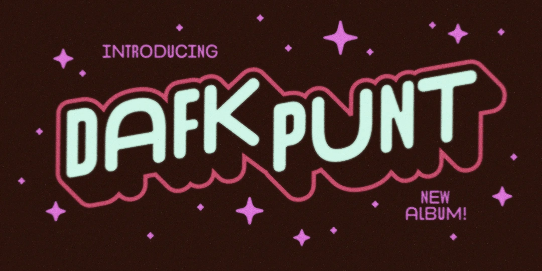
Steven heller takes a closer look at Gilway Paradox: "The paradox is that it is not a beautiful nor an ugly face but a somewhat awkward one that excites something deep inside, reminding me of times of bygone aesthetic enjoyment."
ilovetypography.com
Almost
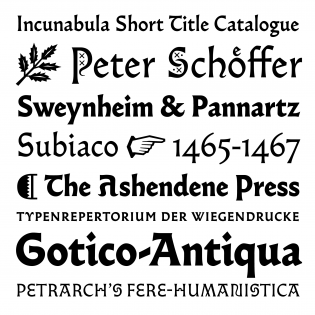
Aside from being a delightful typeface family, Almost opens the door to the discovery of fifteenth-century printing types.
typographica.org

<cite>Typographica</cite> is Twenty Years Old
This website just passed its twentieth birthday. In web years, that’s more like a centennial. At the risk of waxing nostalgic, I’m posting a few highlights from our first year.
typographica.org